
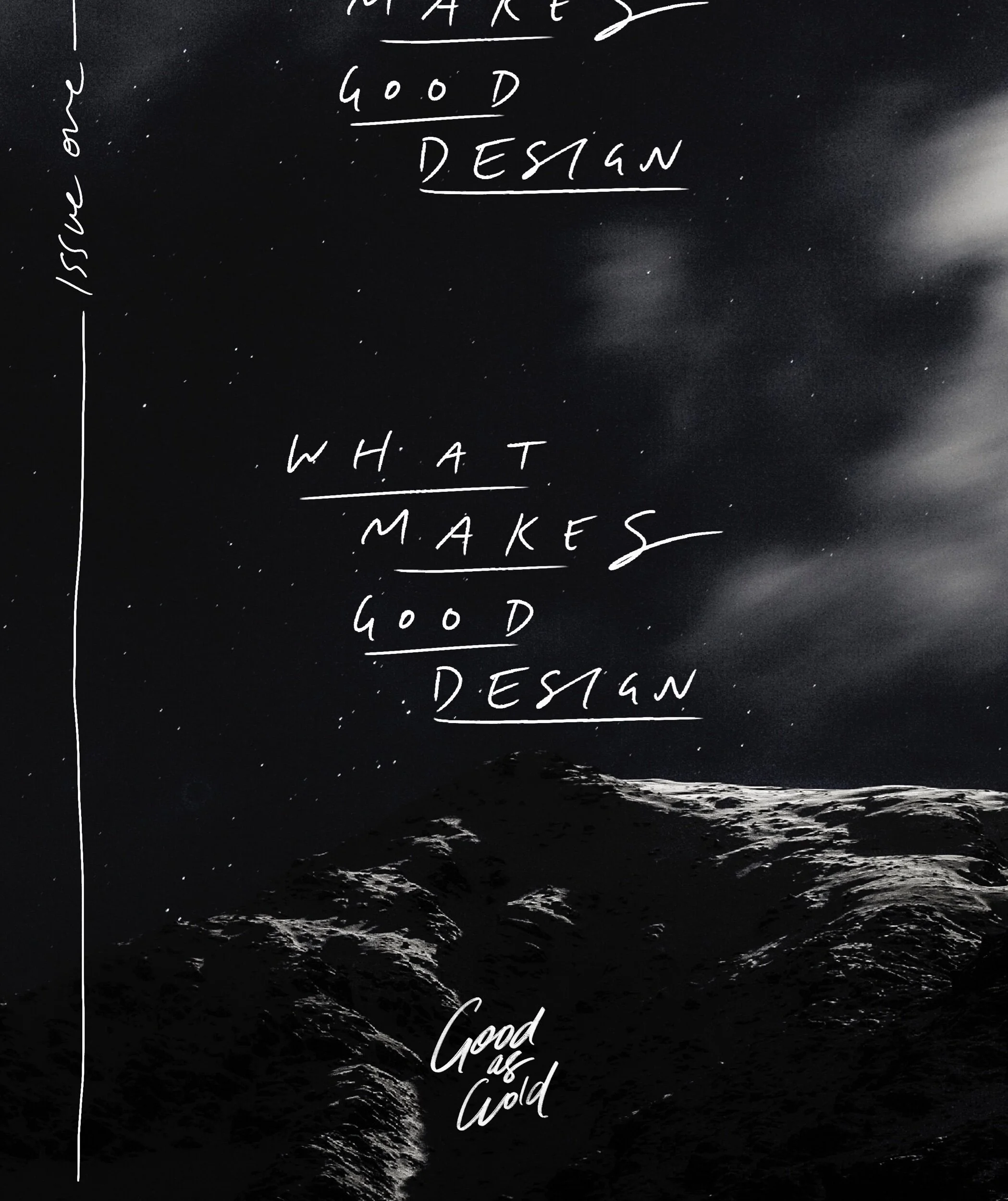
What Makes Good Design — Issue 01
Here's the deal :: when I started Good as Gold Studio, the whole idea behind it was that good design can be accessible and doesn't need to be a luxury.
Part of the bigger picture for Good as Gold is talking a lot more about what makes 'good' design and why things work vs don't work, so you can know what it takes to build a dope website for yourself, or have the knowledge to even just create some dope Insta graphics for yourself, ya know?
Enter the idea for this series... What Makes Good Design.
It's basically exactly what it sounds like. I'm gonna pick out a few pieces of rad design (from things like posters, website pages, Facebook ads, etc) and break down what actually makes them work, and also how you could take those few tips and work them into your own projects.
One side note before we dive in ::
Obvi, design (and anything creative) is totes subjective so what I consider to be 'good design' might look like absolute shit to someone else. That's totes okay. I'm just picking pieces I think are rad and also will be relevant to you.
First up ::
This piece from Anthropologie
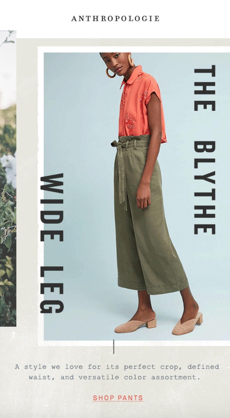
I'm not 100% sure what the context of this image is, but I'm gonna assume it was either on their website or within an email campaign.
Why it works ::
👉It's layered.
Layered designs are my favourite way to give something a bit more depth and interest. You can also see they used a textured background to make it less 'flat' and to add even more depth in there. There's an image cut off to the left (this may have been intentional or a mistake) but either way having elements that flow off the page also mix it up.
👉The text is playful, but still totally readable and legible.
I'm all for getting playful AF with text but when you're selling products and you're creating ads, people need to be able to READ stuff man. How much do you hate it when you see some ad or a poster advertising something and you either have no idea what half of it says, or you have to squint to even have a shot at reading it? Nah girl, bye. We're here for LEGIBLE WORDS yo.
👉The 'Shop' link is in a different, brighter colour.
Seems so simple, but even I forget this rookie mistake sometimes. It also looks like they sampled the colour for 'Shop Pants' from the womans top, which is a 10/10 design tip. It ties it all together real nice and it's clear that the whole point of this design is for you to click through to 'Shop Pants', so it makes sense that it's in a brighter colour.

At first there's a lot going on with this one, but I chose it for a couple reasons...
Why it works ::
👉The repetition is perfect.
Repetition is one of my fave, and one of the easiest ways to juice up a piece of design – when done properly. In this one just the simple act of repeating that 'Sakura' title makes it so rad in my opinion. Again, similar to the Anthropologie piece, having the top title extend off the page also just makes it feel more interesting.
👉No use of black or white text (other than the super small title at the top).
This is something I have to challenge myself sometimes — to try to get out of the habit of using black or white text as the default. It gets boring AF and I just bloody love the colours used in this piece. They're bright and in yer face and they're not gonna be sorry bout it. Also, the text is still totally legible.
And lastly ::
This Instagram post from Go-To

First off, I think Go-To is FOR SURE a Brand that knows their audience and has their whole brand-vibe dialled, which is also why I picked 'em.
Why this Insta post works ::
👉It's peachy AF.
Aka, it's on-brand for them. Some brands are afraid to commit balls-deep with a single brand colour, but not Go-To. Just take a peek at their Instagram or website and you'll see what I mean.
👉This layout is mega simple and so easy to do.
The square, centered image with colourful border and repeating text around the edges look is a vibe. And its 20/10 easy to do in almost any program you can design in, since all you need is to be able to place images, add a background colour, and add + rotate text. Hot tips if you try this layout :: Keep the length of text as short as possible (I'd recommend having it no longer than they have here), make sure the text isn't too big — you still want there to be space on both the top and bottom of the text, and double check everything is centered and aligned properly!
And that's the first round of What Makes Good Design! 🤘
